UX Design Principles for Product Managers
“It is not just what it looks like or feels like. Design is how it works” — Steve Jobs
UX Design is the process of designing a product that is attractive, easy to use and delightful to interact with. UX Design involves UX artefacts and UX Design Principles.

UX Design Artifacts
Critical Elements of UX Design
- Visual Design: How does it look like?
- Usability: How easy it is to use the product.
- Information Architecture: Does its structure make sense?
- Interaction Design: How do we interact with it?
- Wireframing: How does its prototype look like?
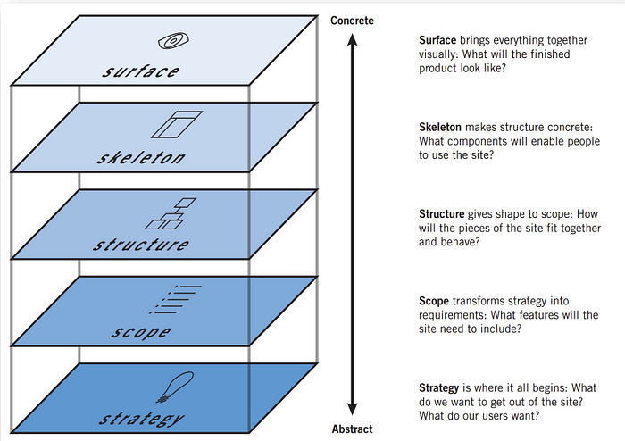
Layers of UX Design
- Strategy: Strategy is where it all begins; what do we want to get out of our product? What does our user want? It is closely related to the user persona and customer journey map etc.
- Scope: Scope transforms strategy to requirement, where the feature lists and story map come into the picture.
- Structure: Structure is the one that gives shape to the scope. It is closely linked to the user flow diagram or the site map.
- Skeleton: Skeleton makes the structure complete; it is what the wireframe is all about.
- Surface: The surface brings all the things together, and it is how the finished product looks. .i.e. prototypes.

UX Design Principles
Gestalt’s Principles
- Law of Similarity: Visually similar Elements will be perceived as related and likely to share a common meaning and functionality. So when we are designing, we should make sure that the navigation/links should be visually differentiated from the text and words.
- Law of Common Region: The items within a boundary are perceived as a group and assumed to share common characteristics and functionality.
- Law of Proximity: The law of proximity states that the elements close together tend to be perceived as a unified group. Proximities help users to understand the information more easily and intuitively.
Aesthetic-Usability Effect
In general, people find the aesthetically pleasing design to be more useful. People are tolerant of minor usability issues if they find the design to be quite aesthetically pleasing.
Peak-End Rule
People generally judge the experience depending on how they felt at its peak and its end, rather than the total sum or average of the experiences. So while designing, we should pay close attention to the peak and the end of the experience in the customer journey. People tend to recall negative experiences more than positive ones.
Serial Position Effect
In general, people tend to vividly recall the first and last item in the journey. So while designing, we can tend to put the least important items in the middle of the list.
Goal Gradient Effect
The goal gradient effect states that as soon people get closer to the goal, they tend to accelerate their behaviour towards the goal. For example, a mobile application uses the profile completion bar at the top, and as your progress towards completing the profile, the profile bar will get filled.
Hick’s Law
Hick’s law states that the time to make a decision increases with the number of choices and their complexity. While designing, we should be aware that we should decrease the number of choices when the response time is critical to increase the decision time.
Von Restorff Effect
Von Restorff's effect states that when multiple objects are present, the one that differs from the rest is most likely to be remembered. While designing, we should make sure that the most important information or the key action should be visually distinctive.
Jacob’s usability Heuristics
- Visibility of System Status: When we are designing, we should keep the user updated on what is going on by timely feedback or with the help of visual cues.
- Match between system and the real world: The system should speak the language of the user rather than system-oriented terms and jargon.
- User Control and Freedom: Most likely, users perform actions by mistake, so they should be given a clear option like an emergency exit to get out of the unwanted action.
- Consistency of standards: We should be consistent while designing; users should not wonder if different words, actions or situations mean the same thing. For example, the check-in counters are located at the front of the hotels, which meets the expectations.
- Error prevention: Good error messages are okay, but fabulous design carefully prevents the problems from occurring in the first place. For example, we have railing guards on curving mountain roads to prevent the driver from falling off the cliff.
- Recognition rather than recall: Minimizing the user’s memory load by making elements, actions and options visible.
- Aesthetics and Minimalist Design: Interface shouldn’t contain irrelevant information. Every extra unit of information we place should be complete with the relevant unit of information.
- Recognise, Diagnose and recover from error: Error messages should be expressed in plain language. It should precisely indicate the problem and constructively suggest the solution.
--TechnoManagers


Comments
Post a Comment